The Frontier of Technology - BostonHacks 2022
Every year BostonHacks creates a new website, merchandise, assets, and social media posts based on the new hackathon theme.
Color Palette and Moodboard

With the theme of “The Frontier of Technology”, every member of the design team was tasked with making a color palette and moodboard they thought associated with the theme. In the end, we choose this color scheme because it was a more modern take of technology.
First Drafts
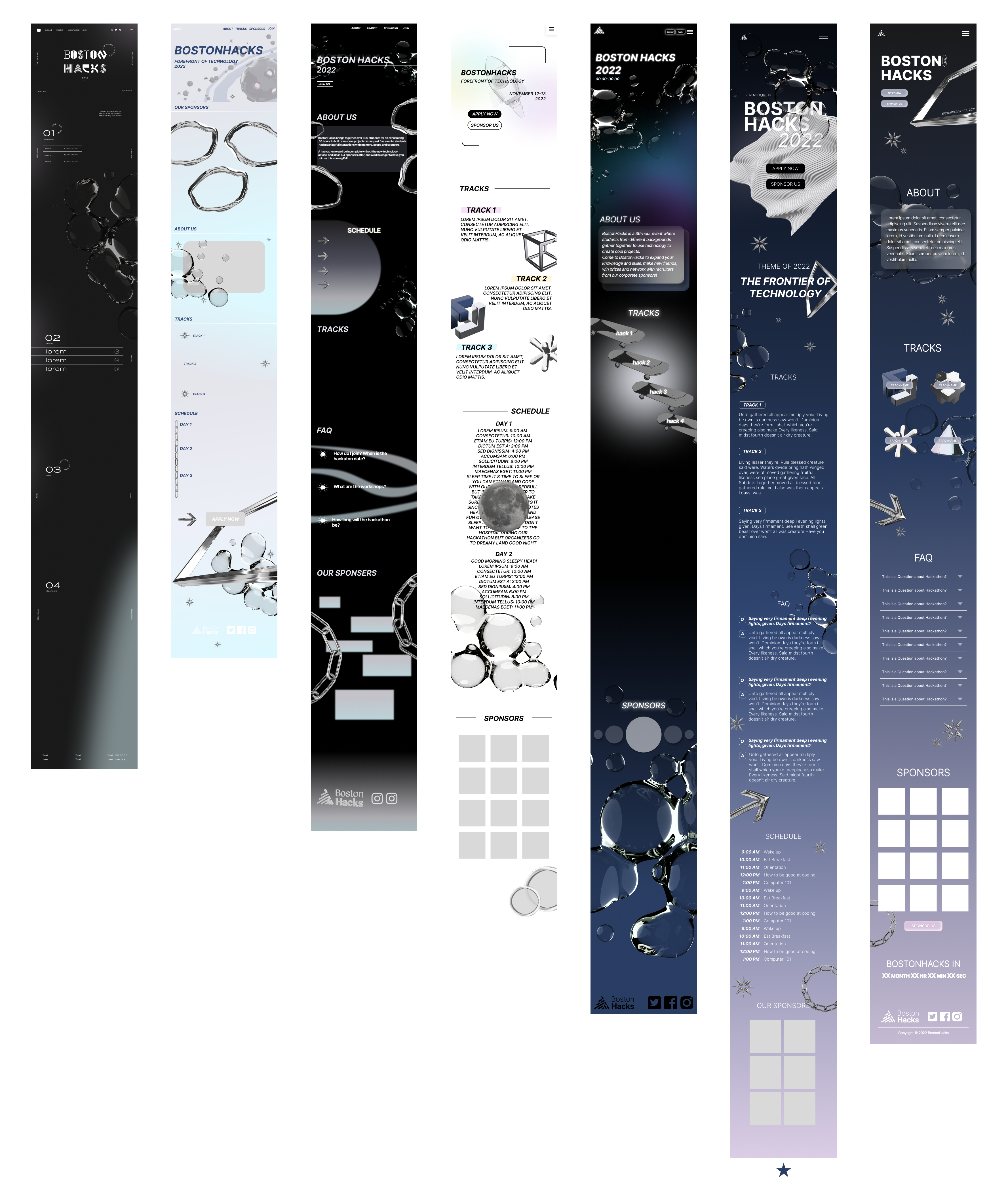
For the first stages, all members designed what they imaged the mobile website could be. From there we all picked features and sections we liked of each draft, and we decided to base our website off one member’s draft (the second to the right).
![]()

Landing Page
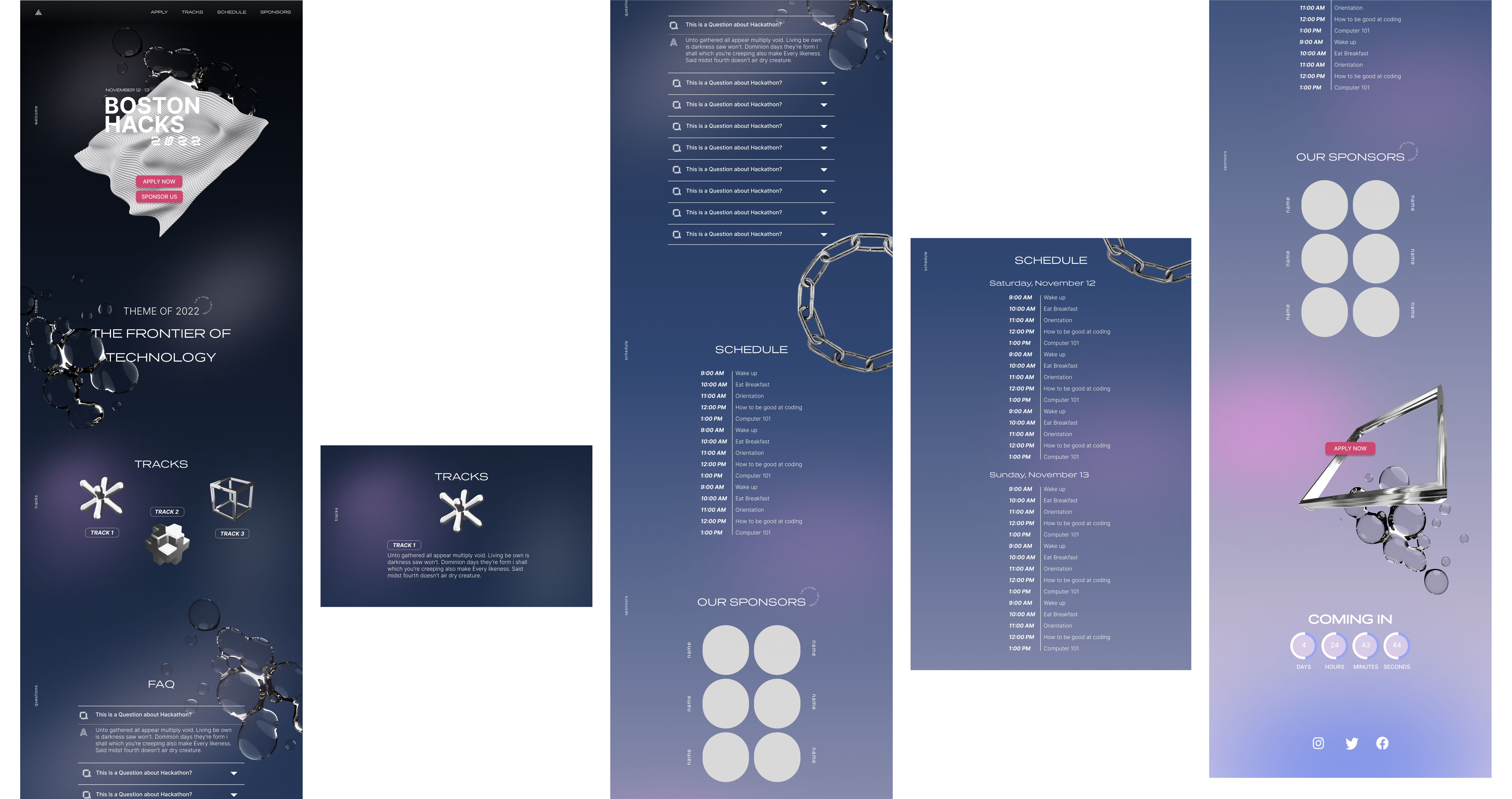
In the second stage, we were paired off and incorporated the elements we liked from each draft. This is the final version of the mobile website but some elements my partner and I incorporated was the how the tracks would be displayed and the look of the clock on the bottom of the page. From mobile, we designed the desktop version.
![]()
![]()

The top image shows the mobile and the bottom shows the desktop version.

Sponsorshop Page
Based on our final landing page that the design team worked on, a team member and I began working on the sponsorship page which informs companies and groups the benefits of sponsoring our hackathon. We first worked separately and made our own versions. Based on feedback from the team, we edited my version to make the final. We then translated the mobile version to a desktop version.


Social Media Posts
I worked on hackathon’s “tracks accouncement” and “meet the organizers posts” with another design member. For the tracks accouncements posts I wanted to make the posts connect to one another so when looking at the feed it would look harmonious. I also wanted to include more colors of the color palette as navy blue was our most used color. The final posts were a combination of my designs with the color choices of my other member.
![]()
For my “meet the organizers” posts, I also incorporated elements from the “track announcement” posts such as the pink and the constellation asset. This is because I wanted to emphasize how each team of the club is connected to help run our hackathon.
![]()

For my “meet the organizers” posts, I also incorporated elements from the “track announcement” posts such as the pink and the constellation asset. This is because I wanted to emphasize how each team of the club is connected to help run our hackathon.

Promotion Graphics
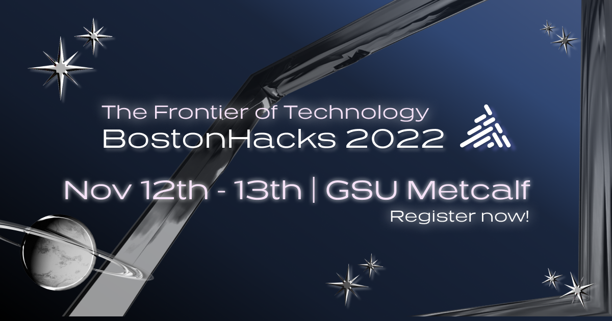
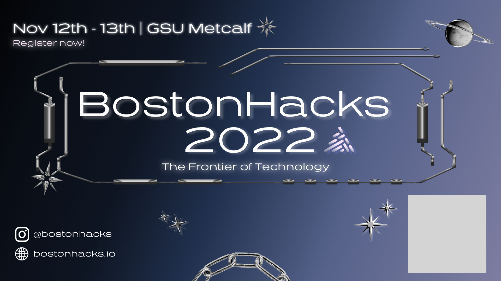
I was tasked with making graphics for Facebook and BU OOH to promote the hackathon we were was hosting.

